Above is a sketchbook I collated before the start of the project along with stuff from really early on. It was a great start as it got me researching for the project an thinking as to what i would want to focus on.
Research and Practical


Not every decision I made to get to the end result was documented in my sketchbook, but in fact a notebook. I copied the relevant notes into a mostly neater fashion so any paths taken don't appear completely out of the blue.


Some pictures from the pre-FMP sketchbook that were under flaps


First set of artist inspiration


This is a little creature I made as a response to Ivan Seals work. A lot of his work looks sculptural so I thought that i could make something similar. If I had time I would add texture with thick plaster then paint over.

Giorgio de Chirico was an artist recommended to me due to the skewed perspective. That aspect of the paintings is what has drawn me to them. It creates a disorientating effect that is slightly uncanny. This specific effect is something i want to bring into my work.


Inspired by de Chirico, I endeavored to replicate his style using a photo I took of the Redhill library/ The Harlequin. I personally don't think i was able to create the same vibe as his works give of but it is a start. In the second version I implemented a glitched effect to link it to the tech feel I want to push for.


On top of the original perspective, I did some more but with tracing paper. One of the reasons being I used newsprint, which is not the best quality.


1 page - left to right
2nd page - right to left
When drawing this comic, I deflauted to the manga layout, which reads left to right. I did not intend this as I was aiming for a layout which works for western audiences


This edit in particular was inspired by the music video of 'It`s All Futile! It`s All Pointless!' by Lovejoy.
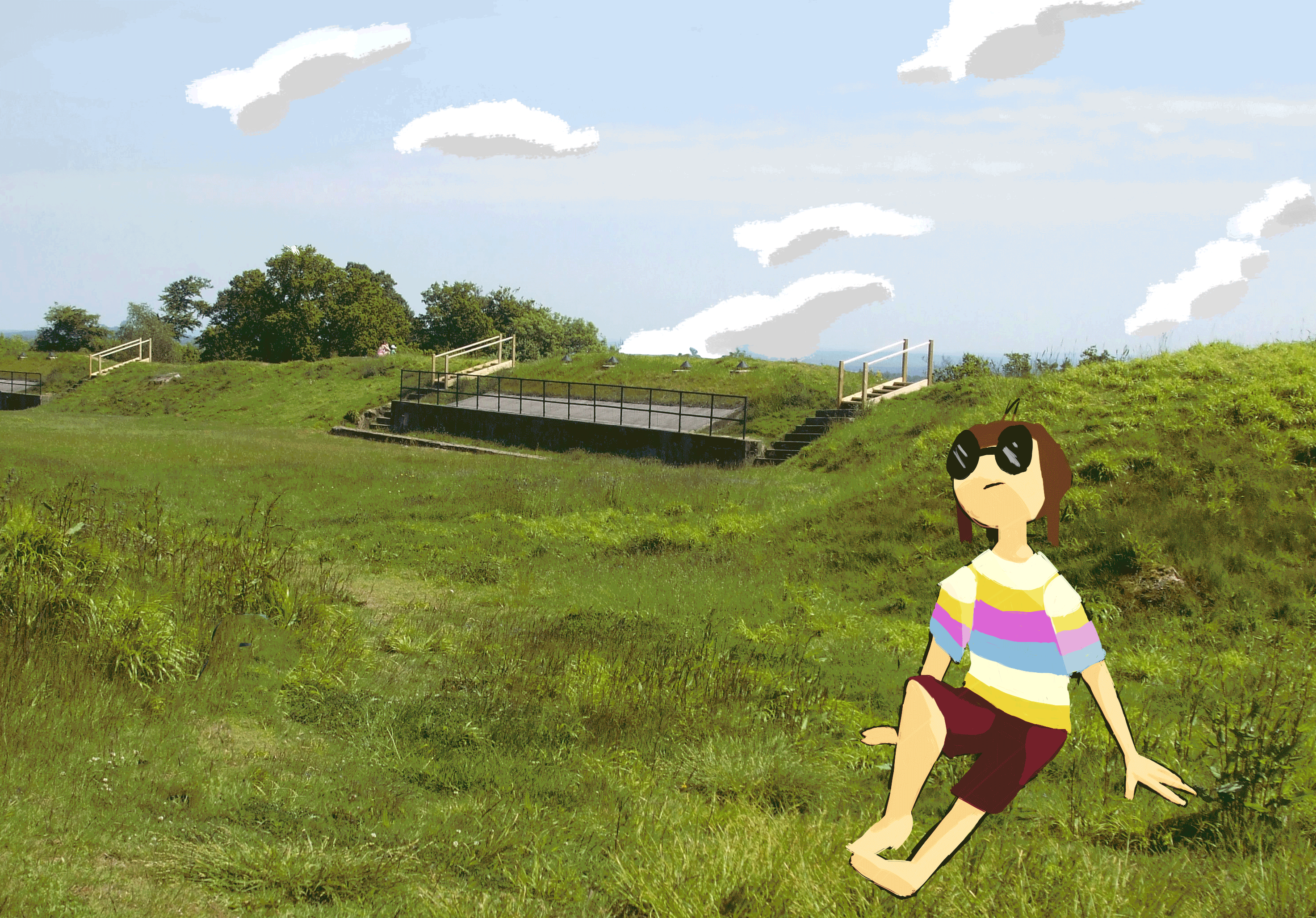
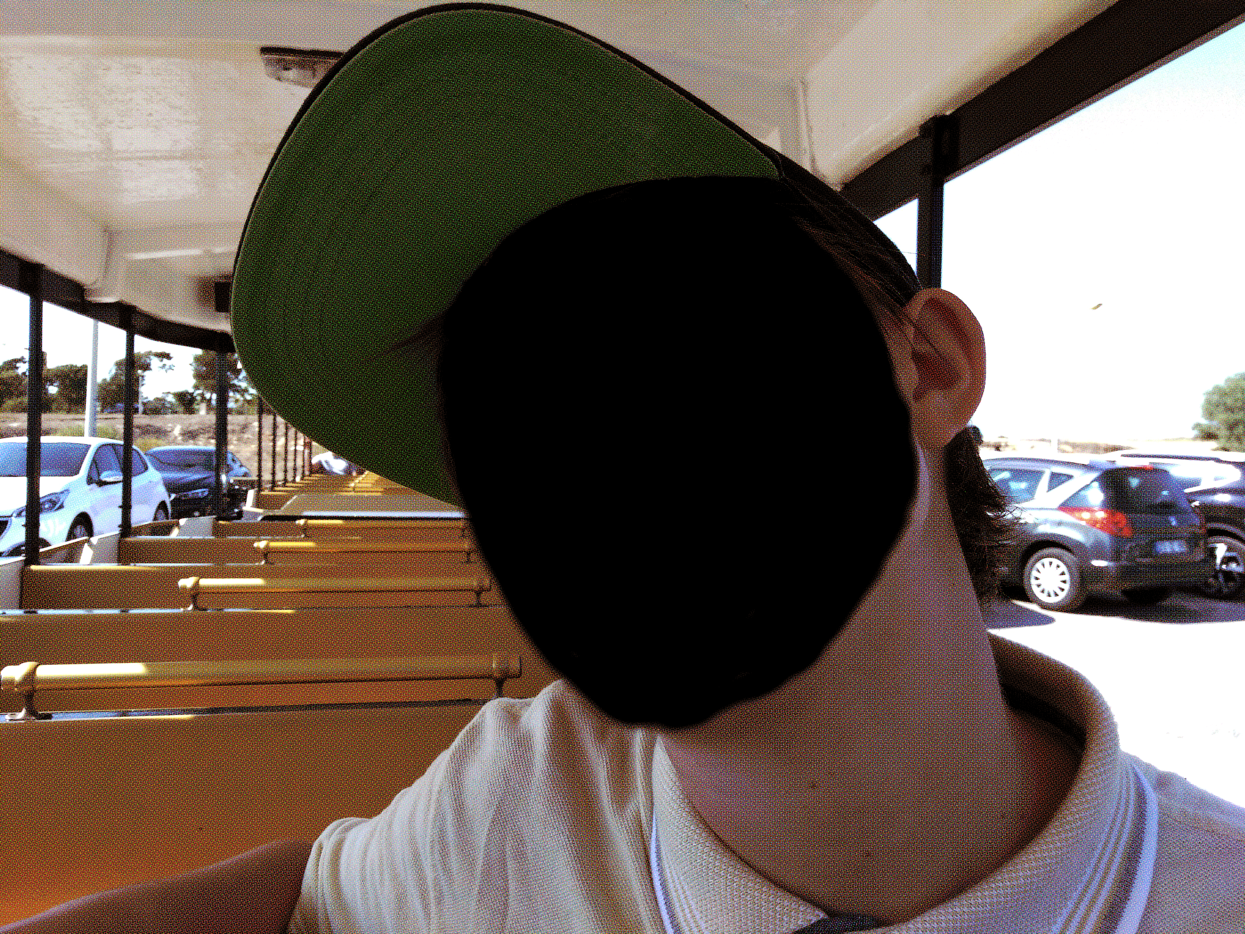
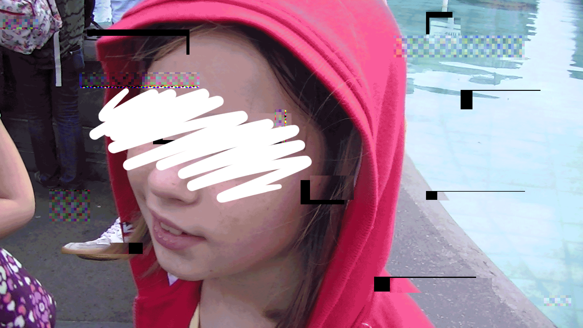
I started to move more digital, the first of my experiments being editing photos on Photoshop. These lacked the natural cuts and edges that doing it physically did but the lines where cleaner. Filters and other such things are also available and i have more of a range of things to use.
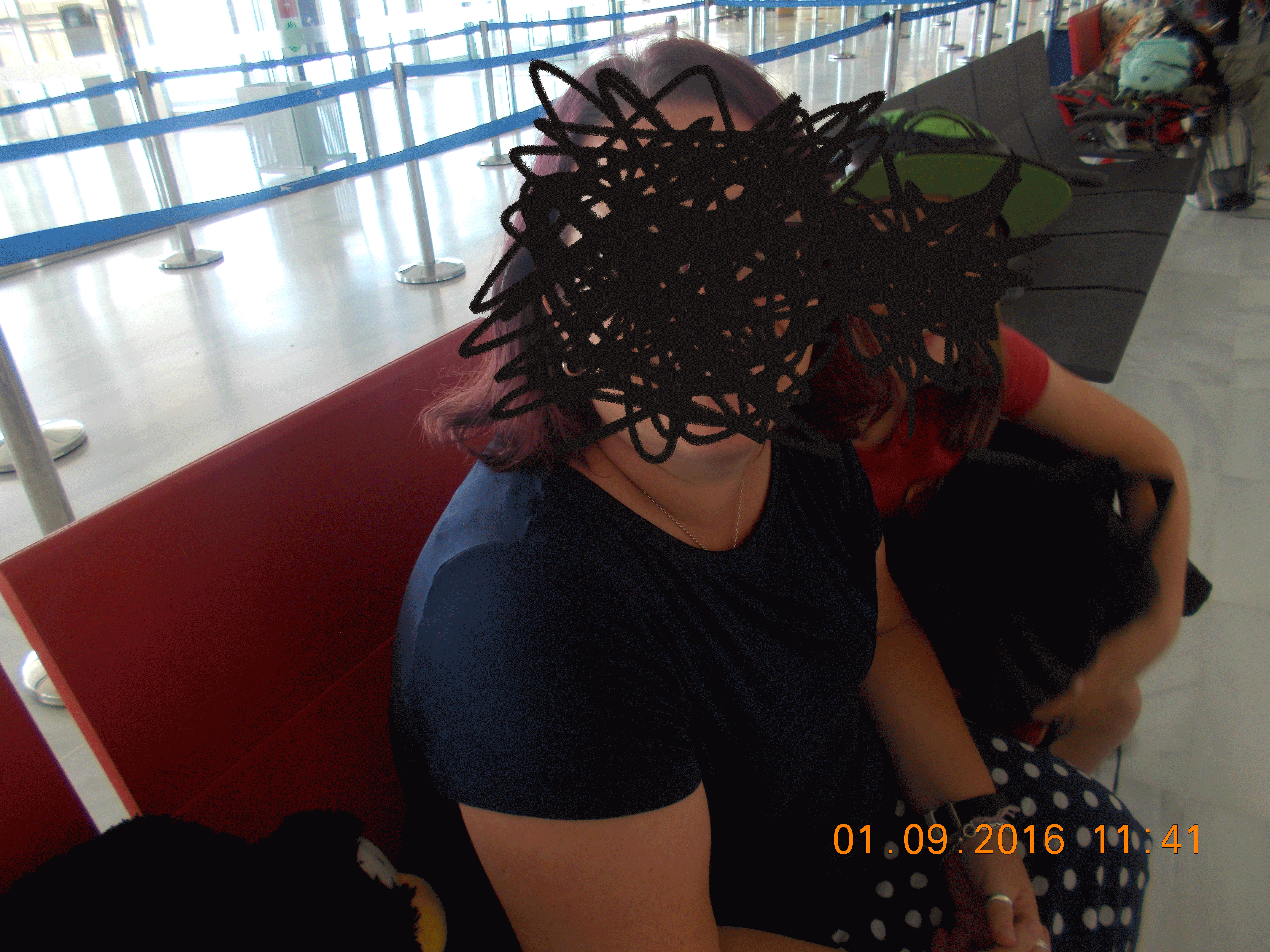
This set of photos turned out reasonably well, except from the one the left. It didn't turn out the way imagined and looks amateurish to my eyes. Something that i wanted to do was to draw roots emerging from the face but i ended up not following through.
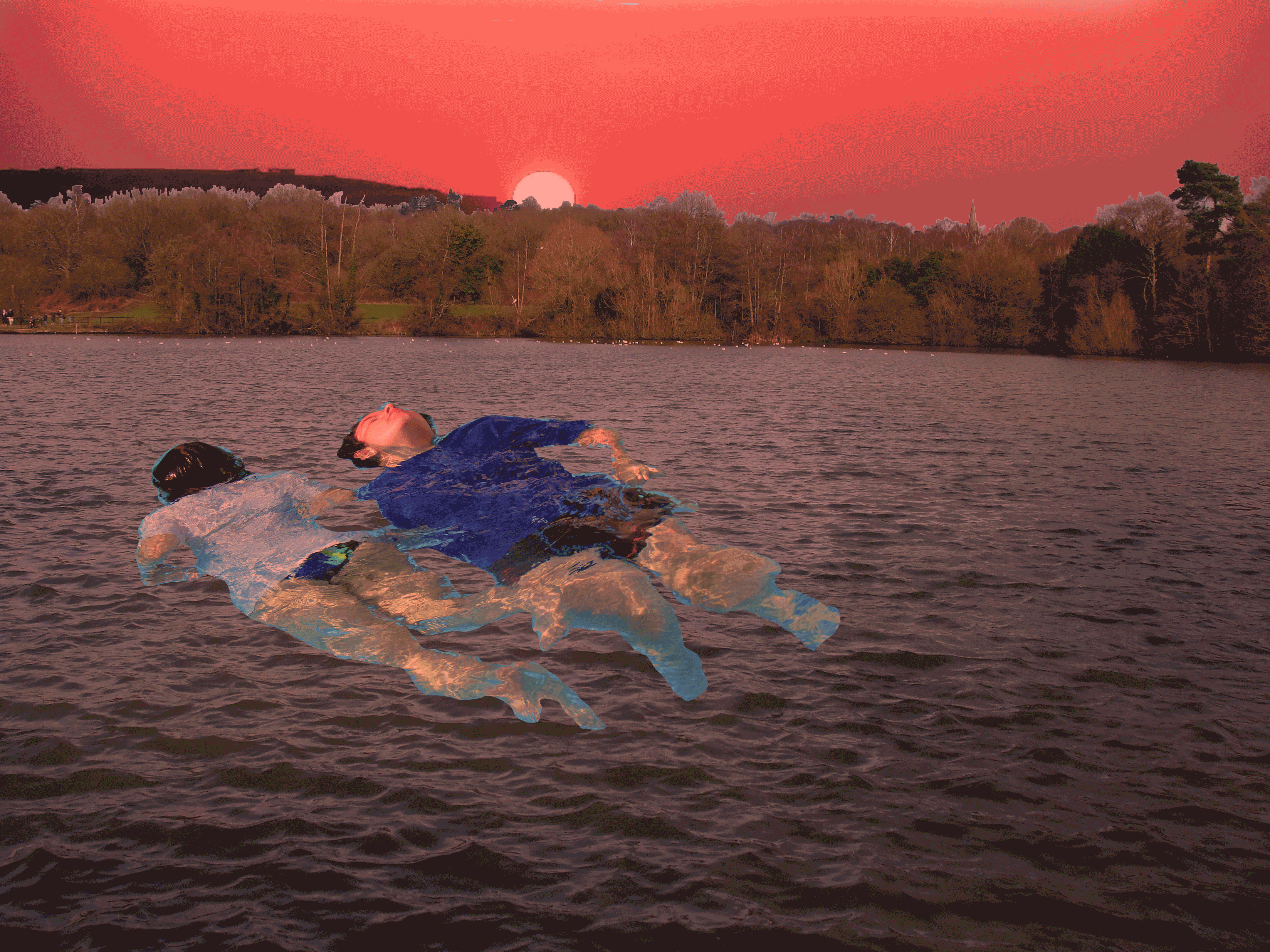

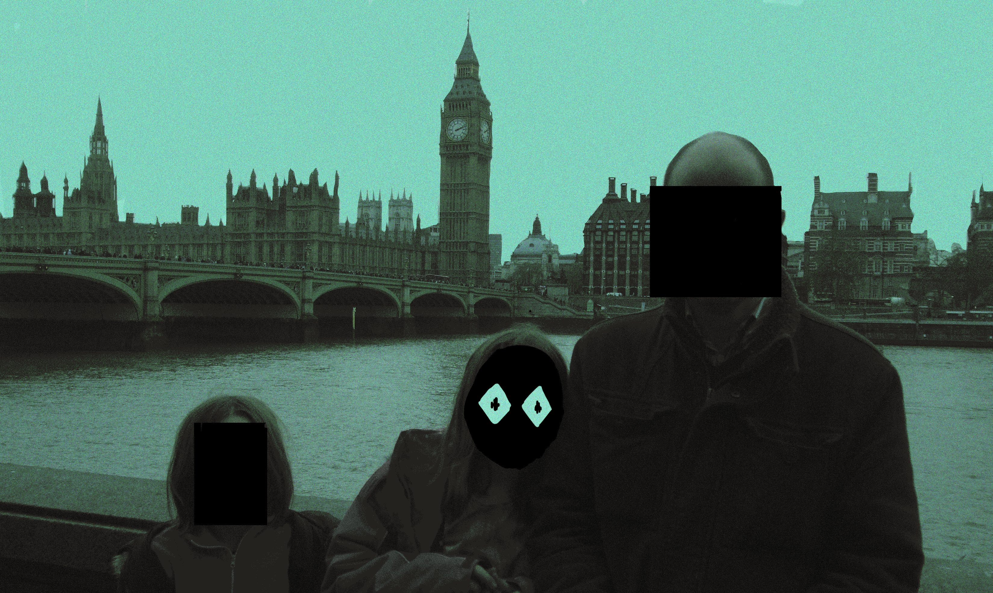


From the Photoshoping, i progressed onto gifs. The process was reasonably simple: use a new layer when I need a new thing to happen, when sorting out each frame make sure what layers visible or not. I liked combining both photos and illustration, it looks disorientating.
There were two other animations i was working on but they were taking too long so I abandoned them. However, they were progressing well so I included them